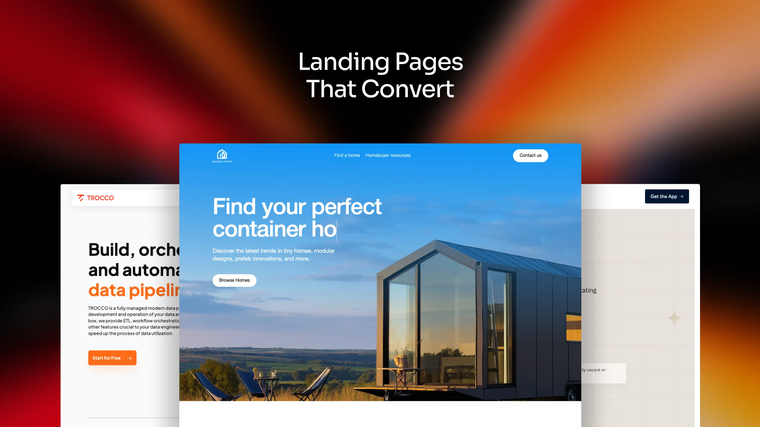
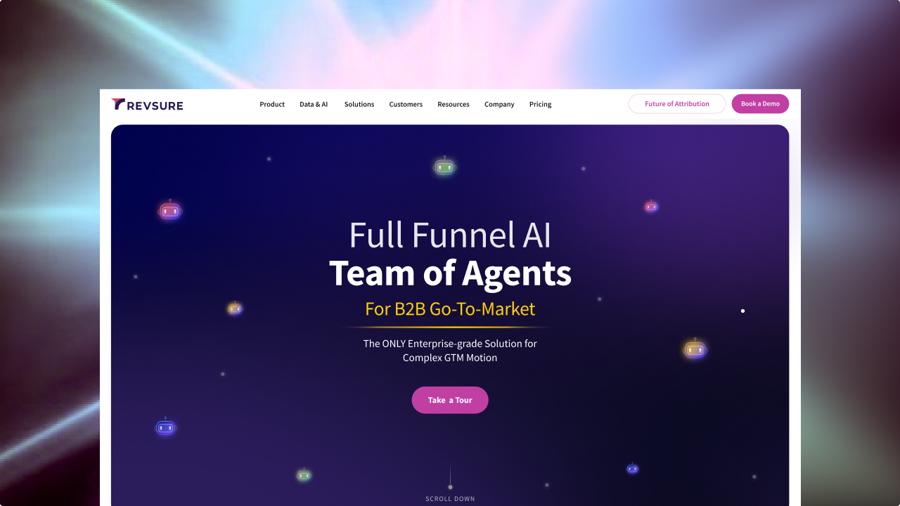
Checkout our work

Parkar


Back
Back
Back
A practical guide to turning curiosity into clicks—and clicks into customers.
Imagine this: You’ve spent weeks planning your campaign, crafted the perfect ad, and finally driven traffic to your page. But then… nothing happens. People land, scroll a bit, and leave.
No sign-ups. No leads. No conversions.
What went wrong?
So let’s talk about what makes a landing page not just look good, but perform well. Below are the key principles backed by experience, psychology, and a whole lot of A/B testing.
This might sound obvious, but it’s where most people slip up.
A landing page should have one clear objective. That means one action you want the visitor to take whether it’s downloading a whitepaper, signing up for a free trial, or requesting a demo. The moment you try to do too much, you lose clarity and conversions.
Visitors don’t have time (or patience) to figure out what to do. Make it simple for them.
Think of your landing page as a guided tunnel, not a maze.
A high-converting landing page speaks directly to a specific type of person. Not “everyone.” Not “users.” A real, defined audience with a problem you’re solving.
Before you start writing, ask:
Use their words. Mirror their concerns. Address their doubts before they even voice them.
If you're offering a productivity tool, don’t say:
“Boost your team’s operational efficiency.
”Say:
“Drowning in tasks? Here’s how to get 6 hours back every week.”
Empathy converts.
Your headline is the first thing people read and often the only thing. If it doesn’t grab their attention in the first few seconds, they’re gone.
A great headline does two things:
Clarity beats cleverness, but if you can do both, perfect.
Try this formula:
[End Result] without [Common Friction]
“Get your custom website live in 7 days, no code, no hassle.”
Support it with a subheadline that explains how you’ll deliver on that promise.
No one buys from a landing page they don’t trust.
That’s why you need to include proof points, right near the top. People want to know: Has this worked for others? Is it safe? Is this company even real?
Trust is a conversion multiplier. The more you build it, the more users will take action.
Your CTA isn’t just a button, it’s the trigger for the outcome you want.
And it needs to stand out visually and emotionally. If your CTA says “Submit,” you’re leaving money on the table. Tell people exactly what they’re getting and why it matters.
Make it bold, bright, and repeated in multiple spots across your page. Don’t make people scroll all the way down to act.
People don’t read every word. They skim. That means your copy needs to be short, sharp, and structured for quick digestion.
Focus on benefits, not features. Instead of telling users what your product does, tell them how it makes their life better.
Instead of this:
“We use AI-powered automation for scalable workflow optimization.”
Say this:
“Save 10+ hours a week with automated workflows, no setup needed.”
Focus on benefits, not features. Instead of telling users what your product does, tell them how it makes their life better.
Good design isn’t just about looking great, it’s about directing attention. Your layout, visuals, colours, and typography should work together to guide the visitor toward your CTA.
The design should feel intentional, not overwhelming.
A beautiful landing page that loads slowly is like a Ferrari stuck in first gear.
Every second of load time increases bounce rates. You’ve done the hard part—don’t lose users to a technical slip.
Your landing page should load in under 3 seconds—ideally under 2.
No landing page gets it perfect the first time.
The real growth comes from iteration.A/B test:
Use tools like Hotjar, Google Optimize, or Webflow CMS + analytics to observe real user behavior and refine accordingly.
Your highest-converting version is always the next version.
The secret to a landing page that converts? Clarity, empathy, and focus.
It’s not about stuffing the page with flashy animations or clever buzzwords. It’s about making the user feel understood and making the next step obvious.
Your job is to reduce friction, build trust, and highlight value. If you do that well, conversions won’t be a guessing game, they’ll be a predictable outcome.
At Nitrous, we specialize in creating landing pages that not only look great, but actually work.
We’ve helped brands across SaaS, beauty, fintech, and compliance industries see real results with conversion-optimized experiences.
If you're ready to turn browsers into buyers,

The journey’s just as exciting as the destination. So, what are you waiting for? Let’s hit the gas.